Into the Gloss
Improving the information architecture of a beauty blog to increase brand revenue and create a new style guide
Who is Into the Gloss?
Into the Gloss is a beauty brand, Glossier’s, flagship blog dedicated to sharing beauty tips and routines that inspire women . The pioneering beauty website was the inspiration for Glossier, resting on the belief that beauty isn't built in a boardroom. Glossier has democratized beauty but ITG has been left behind in the process.
Role
Interaction Design Intern
Tools
Figma, G-Suite, Keynote
Timeline
September 2022 - March 2023
Methods
User Interviews, White Paper Research, Competitive Audit, Sketching, Hi-FI Wireframes, Prototyping
Platforms
Mobile and Desktop
DEFINE
Problem
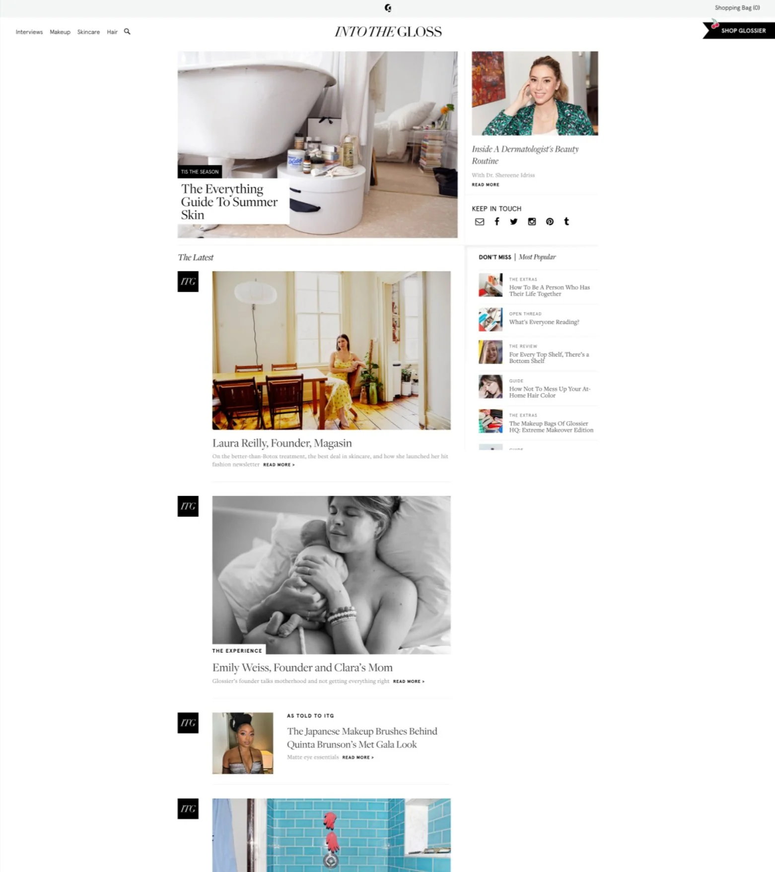
Glossier’s flagship blog ‘Into the Gloss’ has remained fairly stagnant in terms of architecture and layout since its inception. The blog is not keeping up with the digital evolution and needs to shift its design strategy to stay on trend and attract new audiences. The current website showed areas of improvement as noted below:
As seen on current home page shown, there is a lack of page hierarchy. This makes readability and discoverability of content more difficult
Each page throughout the site is structured and designed to look like the home page. Lack of visual diversity throughout the website experience, creates a less engaging experience
Content is static and does not prioritize Gen Z’s viewing habits.
What if Glossier had a revamped design that was more modern and aimed at driving sales towards its Glossier brand?
My team was asked to
Streamline the path to find and sort through ITG’S diverse array of content
Amplify the experience by creating more points of engagement leveraging existing material and creating new ways to increase revenue
Opportunity
SOLUTION
New page hierarchy and creating engagement points
New page hierarchy that improves explorability and readability
Modular sections provide organization
Improves the level of effort in exploring website
Modules that invite the user to explore products
Featuring articles and highlighting products in one module allows users to explore products quickly
Quiz module allows users to find personal recommendation of products
Varied media content for the target user
Adding video content module prioritizes Gen Z’s interests
Creating more diversity in showing posts engages users that are current and invites new users
RESEARCH: UNDERSTANDING OUR AUDIENCE
What are our users like?
Glossier's target audience and cult following is largely made up of millennial women. As the market shifts and Gen Z’s buying power has increased, Glossier has been trying to adapt to target a Gen Z audience. Glossier’s flagship blog ‘Into the Gloss’ has remained fairly stagnant in this transition. My partner and I conducted research and interviewed millennial and Gen Z users to understand the behaviors, motivations, and lifestyles.
These were the takeaways about the values of our target audience:
Milliennials
Cult Following: Self-care drives their spending habits. 23% of female millennials indicate Glossier as one of the main beauty brands they are aware of.
Progressive Ideals: Millennials are more likely to talk about a brand over social media. Image-focused social platforms spark product discovery
Millennial Persona
Gen Z
Shaped by Tech: They are growing up in the age of smartphones and constant connectivity. They value authenticity and want to forge emotional connections with the brands they shop with
Radically Inclusive: This generation is highly self aware. They reject the perfectly curated Instagram vibe and see consumption as an expression of individual identity
Gen Z Persona
COMPETITIVE ANALYSIS AND THE GAP
Competitors had page hierarchy and more diverse content
We did a competitive site audit of four direct competitors (Byrdie, Temptalia, Goop, and Everygirl) and four analogous competitors (People, Bloomberg, Vice, Refinery29).
Takeaways from competitors:
Dynamic and varied modules on the home page that improve readability and discoverability
More storytelling of the brand
Page hierarchy that sections pages
More entry points to exploring products and increase revenue
IDEATION AND DESIGN
Modules and Wireframes
We approached the design using a modular system design to provide a scalable yet structured experience that can flex to the needs of different pages. We started by creating zone diagrams where we identified the different areas of the webpage along with their respective purpose. From there, we moved on to sketching and creating a mid-fidelity wireframe. I created the style guide and the visual design.
Sketches and Wireframes:
Final Designs
Desktop:
Mobile Designs:
VISUAL DESIGN
A brief look at the style guide
CONCLUSION AND NEXT STEPS
What would I do going forward?
Make sure the new navigation menu suits the user
To update the information hierarchy, my partner and I updated the navigation menu to have more options for explorability. We added menu items based on common tags that were seen on blog posts. I would’ve liked to spend more time identifying the appropriate menu items to ensure user needs are met
2. Design more flexible article templates
When we first started ideating about the article designs, we realized that it was hard to fit every different article that we found into one standard article template. I think figuring out a way to design more flexible templates could be helpful and finalizing what templates can work for what kind of articles would make it easier for the client to implement and save time.


